
About This Project
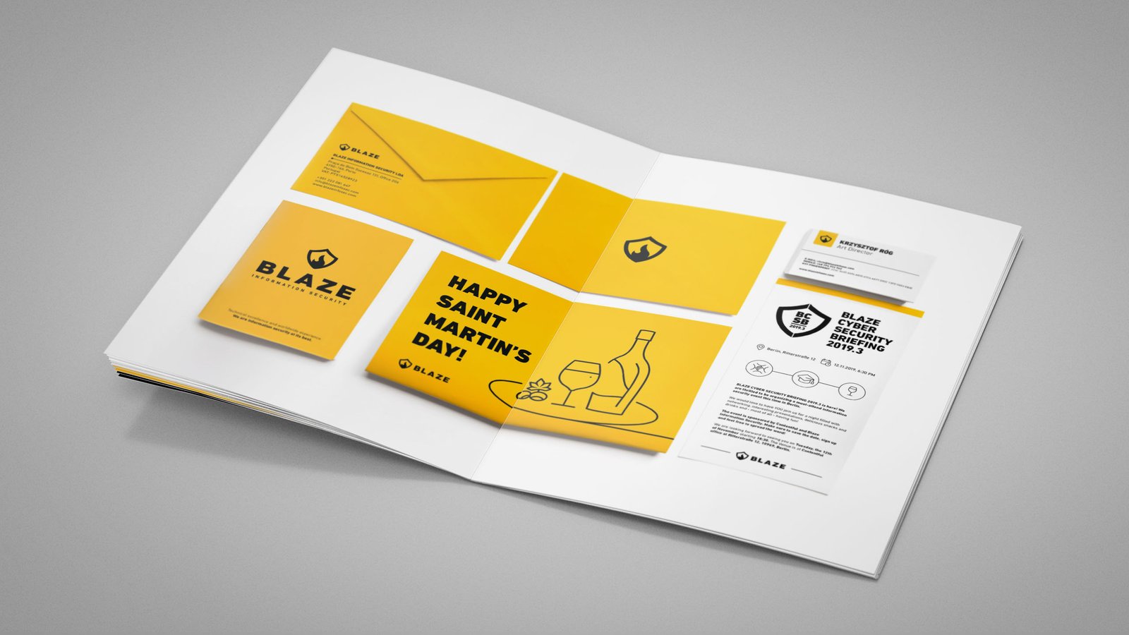
Creating brand awareness was the main goal for directing the brand and creating the brand book. Black on yellow was chosen as an attention-grabbing, high-visibility combination.
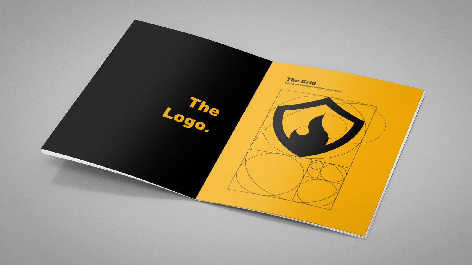
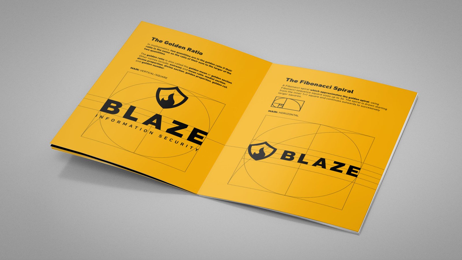
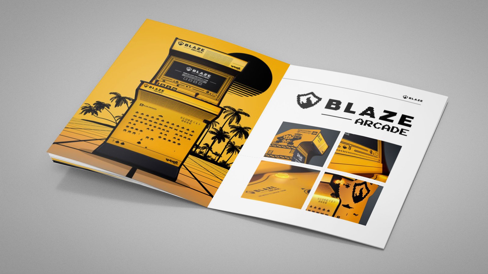
Flat design was chosen mostly for a professional outlook and the corporate target in mind. Visually we decided to “avoiding hacker-cliches”, while embracing the 8-bit style and a lot of throwbacks to the 90’s era – all in line with my and founder’s age.